

JEAN CHARLES DE CASTELBAJAC: TRIUMPH OF THE SIGN
 Share on Facebook
 Share on Twitter
 Subscribe
 Comments
JEAN CHARLES DE CASTELBAJAC: TRIUMPH OF THE SIGN
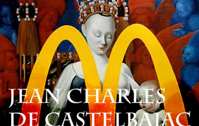
Better known as a fashion designer to the stars JC/DC (to his friends) counts the Pope, Andy Warhol and Madonna among his many clothes horses. His pop art prints have made him a style icon to a generation, sustaining his popularity over 35 years of design. Ranges like JC in the sky with diamonds (2008) are still eagerly lapped up and his profile has allowed him to branch into car design, movie sets and anything that can be brightly printed. Even so, this display represents something of a departure.
Jean Charles bases this exhibtion around the fiery relationship between brand logos; the symbols of our consumer culture, and the output of our most high-minded artists. It seems that our species has lost their way when it comes to the appreciation of the aesthetic. Company badges are more instantly recognisable than the heights of man's artistic endeavours.
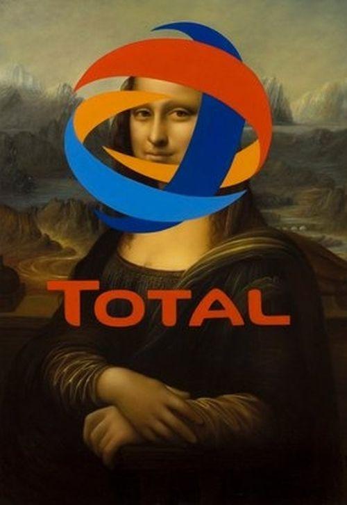
To portray this sorry state of affairs Jean Charles employed the techniques of capitalism through the talents of Chinese mass-production painters to produce his Triumph of the Sign series depicting works by several of the masters, from Bronzino to Manet, obscured by the logos of various big brands. According to the press release his works ironically embrace a flattening of hierarchies, a breakdown of distinctions and an evacuation of content. In other words, he's made great things look bad by cheekily having other people, whose industrial output is usually Fast Moving Consumer Goods, paint over them with widely recognisable symbols. The Marxist quotes from the show's introduction suggest that art is as trapped in substanceless bourgeois as the rest of consumer society.
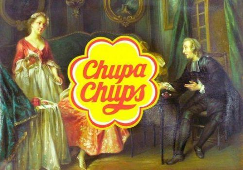
The main issue with the show is that for all its intellectual posturing, it's not exactly a new idea to anyone who has been paying much attention to contemporary art. Combining art and branding in such a way needs to be a little more interesting and have a little more thought put into it to be at all exciting. It's not a very funny ironic joke any more. The real irony of Jean's show, and the production process behind it, is that he comes across as some kind of sweatshop manager of the art world through the method he uses to critique it. There's a town in China called Dafen (www.dafenart.com) that I'm guessing is where Jean sourced his painters. Funny, no?
All that aside, some of the pieces have a great aesthetic, it's just the choice of brands are plain bizarre. The sentiment of the show means jack when applied to the red cross symbol in Arminius Armagnus. I haven't seen many subversive artoganda pieces blasting the Red Cross's work. Yet, irritatingly, it is one of the best looking pieces. On the other hand there is the more understandable stab at consumer culture through the merging of the Total logo and the Mona Lisa in Monalisation, which is a more striking, if basic, statement. Unfortunately it doesn't look very good. The show never manages to marry a great image with an interesting message, which makes the whole thing fall a bit flat.

Triumph of the Sign is on display at the Paradise Row Gallery until 2 May. To see more of Jean Charles De Castelbajac, click here.
Don't Panic attempt to credit photographers and content owners wherever possible, however due to the sheer size and nature of the internet this is sometimes impractical or impossible. If you see any images on our site which you believe belong to yourself or another and we have incorrectly used it please let us know at panic@dontpaniconline.com and we will respond asap.
MORE FROM DON'T PANIC
-

Banksy Creates Simpsons Credits
-

Most Ill-suited Politicians
-

Alexander Ponomarev
-
Pulled Apart By Horses
-

Exposure 10
-

Castlevania: Lords of Shadow
-

Matthew Williamson
-

Maurizio Anzeri
-

Whatever Happened to Mail Art?
-

In Dreams and Michael Patterson-Carver
-

I’m a Dead Celebrity, Exploit Me!
-
Carthy & Swarbrick at Boardwalk





Comments